Start with the page voters expect to find
A first-time candidate does not need a complicated website on day one. The first version should answer the basic questions that voters, reporters, donors, and local organizers will ask: who is running, what office they want, where the race is, what they care about, and how people can help.
That means the first launch should include the candidate name, office, city or district, short biography, issue priorities, donation link, volunteer form, contact path, and legal disclaimer. Those pieces make the site feel real even if endorsements, event photos, news posts, and media coverage are still coming later.
Do not publish empty sections just to look bigger
An empty endorsements page, blank events list, or issue page with one weak sentence can make a campaign look less prepared. It is better to publish a smaller site with complete content than a large menu full of unfinished pages.
Before launch, decide what is ready for public view and what should stay hidden until the campaign has real material. A strong five-page campaign website usually beats a fifteen-page site that feels abandoned.
- Hide endorsement sections until names or organizations are approved.
- Publish events only when dates, times, and locations are confirmed.
- Use a concise biography instead of waiting for a perfect long version.
- Add news posts after the campaign has actual updates.
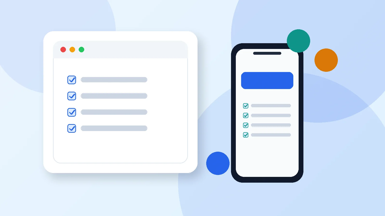
Check the real voter path on a phone
Most voters will not inspect the website from a large desktop monitor. They will open it from a text message, social post, search result, or QR code while holding a phone. The homepage has to make sense at that size.
Before announcing the URL, test the menu, donation button, volunteer form, contact form, candidate photo, and issue pages on a phone. Make sure buttons are easy to tap, the candidate name is readable, and the donation link opens the correct external contribution page.
Treat launch day as the beginning, not the finish line
A campaign website should improve as the race develops. After launch, add endorsements, event photos, press mentions, issue detail, frequently asked questions, and bilingual content when the campaign is ready to support it.
The important thing is to avoid delaying the entire public presence while waiting for perfect content. A credible draft, reviewed and mobile-ready, gives the campaign a place to send people immediately.
Common first-time candidate website mistakes
The most common mistake is trying to make the first website launch feel like a finished campaign headquarters. That pressure leads to delays, empty pages, and last-minute copy that nobody reviews carefully.
A better approach is to launch a complete essentials version, then add depth as the campaign earns it. If the candidate has no endorsements yet, leave endorsements out. If events are not confirmed, do not fake momentum. Credibility matters more than page count.
- Publishing a menu full of unfinished sections
- Using a donation link that has not been tested on mobile
- Forgetting the legal footer until after launch
- Choosing a design before the campaign knows what content it can maintain
A simple first-week website plan
Day one should focus on the homepage, biography, donation path, volunteer form, and disclaimer. Day two can be issue cleanup. Day three can be mobile testing and link review. After that, the campaign can add events, endorsements, photos, and news.
This sequence keeps the campaign moving without pretending everything is done. It also gives volunteers and advisors a clear review path: first check accuracy, then check tone, then check whether voters can take action.
How to use the checklist with real campaign advisors
A first-time candidate usually has more than one person influencing launch decisions: the candidate, treasurer, spouse or family helper, campaign manager, consultant, county party contact, or trusted volunteer. The checklist gives that group a neutral way to review the website without turning every detail into a design debate.
Ask each reviewer to focus on one lane. The candidate should review message and biography. The compliance reviewer should review disclaimer and donation flow. The campaign helper should test forms and mobile navigation. That division keeps launch moving and reduces the chance that one person misses everything at once.
- Message review: biography, issues, office, and slogan
- Action review: donate, volunteer, contact, and event paths
- Compliance review: disclaimer, donation language, and public claims
- Mobile review: homepage, menu, buttons, and forms