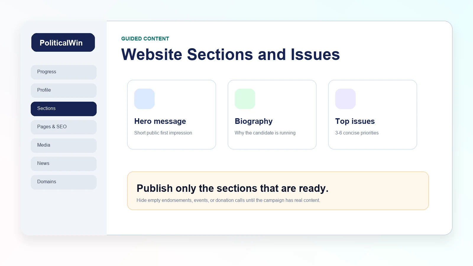
Think in campaign sections, not blank pages
A political campaign website is not a generic brochure. Voters expect a familiar path: homepage, biography, issues, events, volunteer, contact, donation button, news, and legal footer. PoliticalWin uses guided sections so a campaign can fill in those areas without designing every block from scratch.
The advantage is speed and consistency. A candidate can start with the hero message, add a biography, publish three to six priorities, and keep optional sections hidden until they have real content. That is usually better than launching a site with a large menu full of empty pages.
Write the hero for first impressions
The hero is the top of the site. It should tell visitors who the candidate is, what the campaign is about, and what action matters next. It is not the place for a full biography or every policy detail. A short headline, a useful supporting sentence, and clear buttons work best.
If the campaign has a strong candidate photo or rally image, the hero can carry that visual energy. If it does not, a clean template background can still look professional. What matters most is that voters can understand the campaign within a few seconds.
Keep issue cards readable
Issue cards should help voters scan the campaign priorities, not force them through a policy memo. Use clear titles and short summaries on the homepage, then put deeper explanation on the issue detail pages. This keeps the homepage balanced and gives interested voters somewhere to go next.
A good pattern is simple: name the problem, describe the candidate's approach, and avoid exaggerated promises. Campaigns can write with conviction while still sounding practical. That tone is especially important for voters who are still learning about the candidate.
- Use concise issue titles that fit on a card.
- Write short descriptions for homepage previews.
- Add deeper content on the detail page when the campaign has it.
- Keep images relevant to the issue, not random decoration.
Hide sections until they are ready
A site with fewer complete sections usually looks better than a site with many unfinished ones. Endorsements should wait until supporters have approved public use. Events should wait until dates or formats are confirmed. Donation buttons should point to an approved external contribution platform.
The dashboard makes this easier because each section has a clear purpose. Campaigns can build in stages: publish the basics, add campaign updates, then grow the site as the race develops.